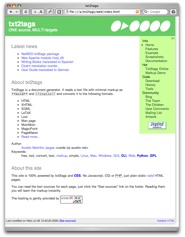
New green site
We've had enough of that gray/blue scary site, don't we? The new txt2tags site is green and was redesigned from scratch.
The problem with the old site (besides its ugliness) was that the menu only appeared in the main page. You follow any link, the menu vanishes. Don't blame me, I'm a programmer, not a webmaster :)
But this year I've learned some web things and the site was improved. Now we have an uniform layout for all pages, with a top header, a menu on the right and a little footer. The light colors are following the Web 2.0 hype. Oh, well...
What really matters is that the site is 100% powered by txt2tags.
It's a showcase of what you can do with the program. All the sources are available and commented, so everybody can study and copy them.
There are some magic involved, using smart filters (PreProc & PostProc), many includes and lots of CSS wizardry. But the outline is simple, using centralized files included by all pages:
- config.t2t: The default options and filters, the URL database.
- menu.t2t: The menu links.
- footer.t2t: The page footer with modification time and link to the sources.
So when creating a new page, all you have to do is:
    My Dogs Page
    Everything about dogs

    %!includeconf: config.t2t
    %!include: menu.t2t

    Content goes here.

    %!include: footer.t2t
On the CSS file you position everything, set sizes and colors. That nice square that points to the current active link on the menu is also made on the CSS.
Now everything is easier to change, user navigation is natural and all the HTML is valid. If you've found all that interesting, feel free to use the txt2tags site sources as a starting point for your own site.
By no means I'm a web guru. Any comments about the new site, suggestions and improvements are very welcome!
